Hello everybody!
Sorry I haven't blogged in a while. I've recently finished filming some of the scenes in the music video.
Here are some storyboards I had prepared for the shoot:
THERAPY SEQUENCE(s)

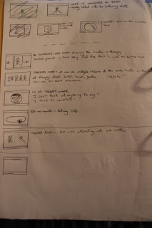


I've lost the storyboard for the GARDEN SEQUENCE, so I cannot show you the storyboard of it. However, I had it on the day and it seemed to work very well. This sequence was set in my back garden to follow the opening lyrics of 'Brain Damage': "The lunatic is on the grass...". I wanted to do a dolly shot moving toward the Lunatic as he simply sits still on the grass. I had to hold the camera whilst being pushed on a wheelchair by - in professional terms - the Grip person. Unfortunately, the camera was rather shaky and moved about quite a lot. So, to resolve it, I used the 'SmoothCam' tool in Final Cut Pro.


This made the camera seem much smoother in its movement. However, the display itself in the video is shaky but the camera appears smooth. I believe I can use this to demonstrate the fragility and disturbance in the Lunatic's mind.


To delve into the Lunatic's mind even further, I decided to modify the colours of the video. I had a specific colour scheme for each of the scenes. This is to show the different scenes which the Lunatic appears to see. I plan on filming an ECU on the Lunatic's eye and every time it blinks, a different colour filter is presented. This is a technique used in Stanley Kubrick's 2001: A Space Odyssey:

With the garden sequence, I had filtered it with green to go with the overall green environment. It also provides an ill or sick effect, which the Lunatic experiences. Following on from that idea, I used a yellow colour filter for the street scene:

I'm debating whether or not to use this filter because I think the blackness really adds to the darkness of this particular scene. I also used this method in the beginning scene in the SPEAK TO ME section. When night fell after filming the garden sequence, I was able to film the Lunatic sitting on the sofa and speaking to his therapist:

Here, I've made the filter more red - which goes well with the furniture and surrounding objects. I think red presents the suggestion of intensity and anger, which I thought appropriate in the therapy scene.
To make it seem like the character is undergoing the symptoms of schizophrenia, I have edited the footage together to give the illusion that he has Multiple-Personality Disorder. In the first part of the dialogue sequence, the shot above is given - angry and trying to prove a point. In the second part, I wanted the Lunatic to be more scared and open to his therapist - so I had him lying down on the sofa:

The Lunatic does not notice this change in personality, which makes it more realistic - in spite of the surreal style.
I wanted to make sure that I had the Laughing Man with the Lunatic in most scenes. So, I included them in both the garden and therapy sequences:

Here, I wanted a good shot from the Lunatic's perspective. So, I decided to compose a Over-The-Shoulder shot to achieve this. It worked well because of the simplicity in the Laughing Man's presence, which is rather terrifying.
In the therapy sequence, I made the Laughing Man be the Therapist. This was to mean that the Lunatic could find no escape and have no trust for anyone in his state:

In this part of the song, there is a cash register sound going on in the background. I have edited two shots together so they become in-sync with this sound:

I thought this editing could symbolise the Lunatic's feeling that the Therapist is only after his money. So, the edit with the sound of the cash register suits this perfectly.
With the ending sequence I had initially intended to replicate the Lunatic three times on the sofa. This would give the illusion that three Lunatics are sitting on this sofa. However, it proved impossible to line up the three images together. So, I decided to just have lines going down the middle - showing that they are on the sofa, yet different from one another:

I will try to improve it but this is the basic image. I want to give off the impression that although they are the same person, they are completely different from one another - without even realising it. The lines down the middle separate them and also give a sense of confinement and claustrophobia.
Sorry I haven't blogged in a while. I've recently finished filming some of the scenes in the music video.
Here are some storyboards I had prepared for the shoot:
THERAPY SEQUENCE(s)


BEDROOM SEQUENCE:
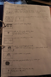
LANDING SEQUENCE (1):


LANDING SEQUENCE (2):

HALLWAY SEQUENCE:
KITCHEN SEQUENCE:


HALLWAY SEQUENCE(s) (2):

I've lost the storyboard for the GARDEN SEQUENCE, so I cannot show you the storyboard of it. However, I had it on the day and it seemed to work very well. This sequence was set in my back garden to follow the opening lyrics of 'Brain Damage': "The lunatic is on the grass...". I wanted to do a dolly shot moving toward the Lunatic as he simply sits still on the grass. I had to hold the camera whilst being pushed on a wheelchair by - in professional terms - the Grip person. Unfortunately, the camera was rather shaky and moved about quite a lot. So, to resolve it, I used the 'SmoothCam' tool in Final Cut Pro.


This made the camera seem much smoother in its movement. However, the display itself in the video is shaky but the camera appears smooth. I believe I can use this to demonstrate the fragility and disturbance in the Lunatic's mind.


To delve into the Lunatic's mind even further, I decided to modify the colours of the video. I had a specific colour scheme for each of the scenes. This is to show the different scenes which the Lunatic appears to see. I plan on filming an ECU on the Lunatic's eye and every time it blinks, a different colour filter is presented. This is a technique used in Stanley Kubrick's 2001: A Space Odyssey:

With the garden sequence, I had filtered it with green to go with the overall green environment. It also provides an ill or sick effect, which the Lunatic experiences. Following on from that idea, I used a yellow colour filter for the street scene:

I'm debating whether or not to use this filter because I think the blackness really adds to the darkness of this particular scene. I also used this method in the beginning scene in the SPEAK TO ME section. When night fell after filming the garden sequence, I was able to film the Lunatic sitting on the sofa and speaking to his therapist:

Here, I've made the filter more red - which goes well with the furniture and surrounding objects. I think red presents the suggestion of intensity and anger, which I thought appropriate in the therapy scene.
To make it seem like the character is undergoing the symptoms of schizophrenia, I have edited the footage together to give the illusion that he has Multiple-Personality Disorder. In the first part of the dialogue sequence, the shot above is given - angry and trying to prove a point. In the second part, I wanted the Lunatic to be more scared and open to his therapist - so I had him lying down on the sofa:

The Lunatic does not notice this change in personality, which makes it more realistic - in spite of the surreal style.
I wanted to make sure that I had the Laughing Man with the Lunatic in most scenes. So, I included them in both the garden and therapy sequences:

Here, I wanted a good shot from the Lunatic's perspective. So, I decided to compose a Over-The-Shoulder shot to achieve this. It worked well because of the simplicity in the Laughing Man's presence, which is rather terrifying.
In the therapy sequence, I made the Laughing Man be the Therapist. This was to mean that the Lunatic could find no escape and have no trust for anyone in his state:

In this part of the song, there is a cash register sound going on in the background. I have edited two shots together so they become in-sync with this sound:

I thought this editing could symbolise the Lunatic's feeling that the Therapist is only after his money. So, the edit with the sound of the cash register suits this perfectly.
With the ending sequence I had initially intended to replicate the Lunatic three times on the sofa. This would give the illusion that three Lunatics are sitting on this sofa. However, it proved impossible to line up the three images together. So, I decided to just have lines going down the middle - showing that they are on the sofa, yet different from one another:

I will try to improve it but this is the basic image. I want to give off the impression that although they are the same person, they are completely different from one another - without even realising it. The lines down the middle separate them and also give a sense of confinement and claustrophobia.
.JPG)
.JPG)
.JPG)


