Tuesday, February 5, 2013

Exterior Location Pics

I took some night shots of my street because I had an idea of another setting. 

 I thought that maybe the Lunatic could walk out onto his street. He looks up at the lamp-post closest to him. He then looks down and sees THE LAUGHING MAN standing under the light - as if he were being spotlit. The Lunatic runs back into the house.
I'm not sure whether to include this because it is set outside of the house. I want that sense of seclusion and claustrophobia - and I fear that I'll lose that with these shots. But I love the darkness and the emptiness of the street, which looks a lot like a dreamscape.

I also wish to use my back garden as a location. I think it is quite a good setting for the lyric "The lunatic is on the grass".


Like in my "Practice Filming" video, I'm going to have my protagonist - THE LUNATIC - sitting in front of the tree in the centre. The camera will move gradually toward him in a dolly as the music continues. In the edit, I'll keep cutting it so when singing is involved, we can see him singing it. Also in the edit I will reduce the colour more, perhaps giving it a more grey and depressing look - since that is the overall style of the video. THE LAUGHING MAN will only be featured towards the end of the video in this location, looming over the LUNATIC as he sits there.


The final exterior location will be in Knole Park, just on the edge of the forest. I have previously used this location for other film projects:


I think that this place a surreal vibe to it. I love the fallen tree-trunk being in between two standing trees. I also think that it would be good to have THE LAUGHING MAN sitting on one side and THE LUNATIC sitting on the other. I plan on naming the bad "GOOD VERSUS EVIL", so this idea would suit this identity. In the edit, I will darken it to make it seem more surreal and dark. It will be difficult to carry all of our equipment to Knole Park, but we managed before! 


Thursday, January 31, 2013

First Night of Shooting (and a little editing)

I have recently completed my first night of shooting in the STREET. It was more effective than I could ever imagine. The light from the street lamps gave the image a dark and phantasmic effect, which is exactly what I was trying to achieve.

I began with filming the close-up:


For this particular section in the music video, I wanted a close-up like this. I centred him so the consumer's interest is not distracted. I kept a shallow focus on the LUNATIC's face to maintain this intention. However, in the editing stage, I thought the image was too far out and needed to be closer. I managed to do this using the resizing tool in Final Cut Pro:


I now feel much closer to this character, merely by closing in on him. We can also see more of his face, which allows the audience to empathise more with him.

A similar situation happened with the LUNATIC's high-angle close-up:


I took inspiration from 30 Seconds To Mars's video "THE KILL (BURY ME)", where they feature a similar kind of close-up:


I even applied eyeliner to my central character to make him seem darker. But I had to get closer to him, to make it seem more personal. The LUNATIC only has this shot when particularly dramatic events happen within the song. It is used during one of the screams at the end of SPEAK TO ME (and beginning of BREATHE) and during the lyrics "And if the dam breaks open many years too soon" in BRAIN DAMAGE. Here was the result:


Unfortunately, the image appears slightly out of focus. I may have to film this shot again later in the course.

I played with the focus during a wide Over-The-Shoulder shot of the LUNATIC staring at the antagonist, THE LAUGHING MAN. I began with it completely out of focus:


Then I created a deep focus so we can see both subjects clearly:


This is to create the impression of a "stand-off". It allows the audience to see what is being uncovered to us. Being an enigmatic piece, they will have to be active in interpreting it.
I doubt I'll alter the colour much in the editing stage, which many people seem to do. I feel that the light and colour are perfect as they are.

I then focused more on the THE LAUGHING MAN.


I decided to use a Venetian mask because of the fear it evokes. The use of a smiling mask seems somewhat inappropriate in a dark scenario. This incomprehension brings this fear from the audience. The suit adds to the mystery of THE LAUGHING MAN. I thought he could be an official dark presence, ever haunting the LUNATIC. It is his official business to drive him insane.
With this particular image, I did not centre him like I did the LUNATIC. Our eyes are naturally drawn to him because of his current position. Nothing moves around him and he does not look at anything else but the LUNATIC. I also think that if I did centre him, it will provide the audience with empathy for this character. This is not what I want at all. I want the audience to fear and hate the LAUGHING MAN, without necessarily knowing why. I took inspiration from the shot in 'Donnie Darko':


This figure is centred, but this is because the character does not have hate for Frank the bunny rabbit. If anything, he has admiration for him. I did not want to have THE LAUGHING MAN sympathised with in any way. To further pursue this, I did this shot:


This low-angle, dutch-tilt close-up provided an even larger fear within this character - domination. From a low-angle, he looks far more victorious over the LUNATIC - thus having further control over him. As the viewer, we do not want THE LAUGHING MAN to have this power. The dutch-tilt effect seemed fitting to the surreal and weird scenario but it also makes us feel uneasy. This are the feelings of the LUNATIC. Therefore, we are brought to the LUNATIC's level. The light on his face allows us to seem him perfectly, without removing his mystery. The yellowness provides us further with the sense of uneasiness and surrealism.


Sunday, January 27, 2013

Shooting Schedule - STREET SCENE

This is my shooting schedule for later this evening. I will do a larger one for the rest of the video later on. For now, this is my plan:


Storyboards - STREET SCENE

I'm planning on shooting one of the scenes in my music video on the 27th January, which is tomorrow. I've done some storyboards to know exactly what I'm doing.


It is not in order but I have placed the lyrics alongside each shot. This will allow me to determine which part of the song fits with which shots. 

The Lunatic's normal close-ups and shots of The Laughing Man were mainly inspired by a scene in 'Donnie Darko' - it happens at 9:18 in this video:


I thought it could suit Andrew Goodwin's theory of intertextual references. Except for the antagonist being in a golf course, mine will be under a street lamp. The Lunatic will be under another streetlamp. They will face one another. I thought that the Lunatic and the Laughing Man could be contentedly imprisoned in this nice pool of light. But one can still influence the other to going into darkness.

I thought the use of ECUs on the eyes would be appropriate here. I thought I'd copy the technique used by Sergio Leone in "The Good, The Bad and The Ugly" (from 7:10 onwards):


I thought that idea of a stand-off between the Lunatic and The Laughing Man would do well. The ECUs could also be rapidly cut together to suit the music when the pace quickens. It would also be good to try and copy the over-head shots and the wides to suit that kind of atmosphere.


Tuesday, December 11, 2012

Video Format

I thought I'd try and copy what 30 Seconds To Mars do with their music videos. They fashion them as short films - cutting the song to fit in with the film. They do this successfully with these three videos:


Jared Leto, under the pseudonym Bartholomew Cubbins, has directed all of these videos. It seems appropriate because of his film acting career. I don't think I will split the video into the typical narrative stages like in the videos above. I would prefer to use a mostly non-linear narrative to display the Lunatic's current mindset. I would also want to copy a lot of 30 Seconds To Mars's style. I think the band's dark identity (black hair, black nail varnish, black clothing, dark subject matter) would suit the overall look that I want to achieve.

I'm working on a few surreal ideas for the video. I've decided to establish what locations I am going to use and what is involved in them. I will post a blog of these soon.

Sunday, December 2, 2012

Interior Location Pics/Live Shot List

Because I am setting a large amount of my video in my house, I decided to take some pictures in areas which I thought would be ideal. I took most of them at night so that it suits the darker elements of the video.

The following photos were taken in my bedroom. I was at first trying to experiment with three stages of light from high-key all the way down to low-key:


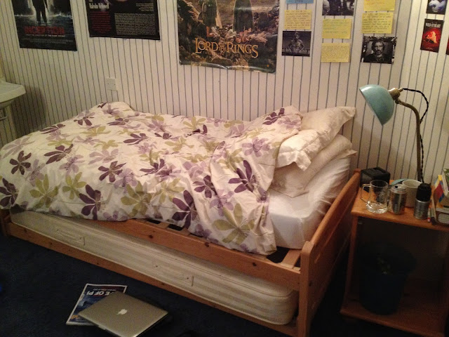
I wanted to see at what level would suit best for what I want to create. I think it may be the second stage which will be chosen. I was thinking of a scene where my antagonist, THE LAUGHING MAN, stands at the foot of the bed - staring at our protagonist, THE LUNATIC. I haven't done a POV shot for TLM in the second stage of lighting yet, but I have done one in the first and third stage:


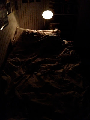
I think there needs to one in second-stage lighting because we would not be able to see TLM standing over TL.

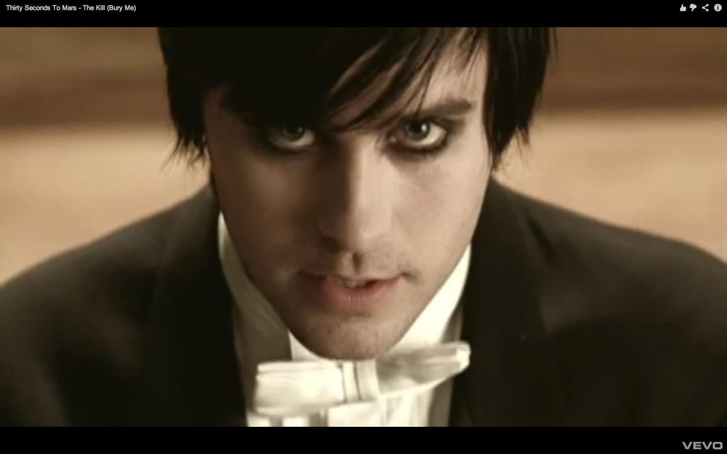
The bedroom will be an interesting inclusion for the music video because it will allow the audience to see what kind of character TL is. So, a lot of work will have to be done for the mise-en-scene. I'm thinking of peculiar and sexual posters around the walls, weird drawings of TLM and maybe books to show he has an education. This is similar to Donnie's room in the 2001 film Donnie Darko, which I will take a lot of inspiration from - as well as making some intertextual references to.


I also took pictures of my landing. I thought this would be good because it is almost like a narrow corridor and this device is often used in horror films - particularly in The Shining. I also thought the wallpaper has a slight resemblance to prison bars, which can be used as an extended metaphor in the video. He can be trapped in his own mind; unable to escape. In the scene where this is used, I thought TLM can be standing on the other side of the landing - staring at TL as he enters. TLM then goes down the stairs - stiffly and slowly. I want the TL to be following TLM all through the video - representing a) TL's curiosity and fear and b) his own mind going deeper and deeper into darkness. 


I thought this bottom shot could be used, once again, for TLM's point-of-view. TLM is essentially TL's evil twin. But the evil twin is leading TL into darkness to join him. Or at least, this is the embodiment that TL imagines.

I also love the idea of having mirrors in the music video. This dwells on inspiration from The Shining where it is theorised that Jack Torrence only sees the Overlook ghosts when in contact with mirrors.


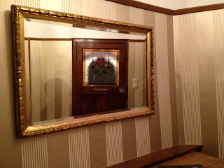
If we extend this further into schizophrenic territory, the ghosts can either be seen as mirror images of himself or their way of stimulating self-doubt and anxiety. In any sense, I would like to have TL looking in the mirror and have a glimpse of TLM. I'm not sure whether to have a quick cut of TLM standing behind him or a quick cut of TL wearing the mask. I'm not sure if the latter would give too much of the intended ending away. However, it can be seen as TLM attempting to grasp TL and pull him into darkness. TL has to pull himself away - he strives to be good.


I like the idea of having a high angle shot looking down the stairs. This would be when TL has decided to cross the landing and go down the stairs. I like the idea of the shot being done like this because it's almost as if TL is descending further and further down into a dark abyss. Now, I'm thinking that the hallway needs to be very dark to connote this.


I thought that as he descends, we should have this handheld insert:


With darkness from the hallway juxtaposed with the light from the upstairs landing, it will look like that TL is going deeper and deeper into darkness. I think it gives the video more energy.

There has to be one light on when TL is in the hallway, which he is attracted to. This will be from the kitchen - where his girlfriend/boyfriend is washing dishes.


The girlfriend/boyfriend will be washing dishes. At first, the audience sees her/him and he/she looks ordinary. However, when TL enters he thinks that he sees TLM washing the dishes. TL doesn't want to be tormented any longer and he thinks he can take TLM. But it is really the girlfriend/boyfriend and so when TL goes for the attack, the g/b is weak. TL throws her in a cupboard and locks her in... throwing the key on a pile of biscuits ("you lock the door... and throw away the key").

In the initial scenes when SPEAK TO ME is playing, I want to have TL in a therapeutic environment. So, I thought about using my sitting room:


The therapist would be sitting on the chair on the left, and TL will lie or sit on the sofa to the right. I'm not sure whether I would prefer to do this in the daytime or the nighttime because this is set after the events which we are about to see. If we have it in darkness, then it indicates that there is a hopelessness and TL cannot be saved from the dark engrossing in his mind. However, in therapy, TL doesn't need to be secluded because he openly discusses his mental illness. So, the presence of light will act as a brief step into the "Good World" from the "Bad World".

I would also want to portray the paranoia side of the schizophrenia within him. To achieve this, I would like there to be a separate video camera intended for filming the therapy session. However, this camera is broadcasting much like a reality TV show (Big Brother, etc.). This is a postmodern way of portraying schizophrenia:


So, I would have inserts of people watching TL on their own television screens. I want TL to have two different personas to suit the structure of the song (which has two voices of dialogue) - as well as feed in Multiple Personality Disorder, which occurs in many schizophrenics. So, one would be sitting upright in the centre of the sofa and one will be lying down - thus indicating two completely different personas.

I would want there to be few other wide shots in the film, focusing mainly on the close-ups. This shows a close interaction between the THERAPIST and TL. For instance:


Obviously, with people there it would be more effective - but you get the basic idea. I also like the red colour scheme, which I would like to present as being representative of TL's anger and frustration. 

Saturday, December 1, 2012

DIGIPAK ANALYSIS - "The Wall"

I will now analyse the digipak for the 1979 album "The Wall" by Pink Floyd. I obtained the photos from the iTunes LP feature that came with purchasing the album.


This is the front cover of the album. This is the 2011 digitally remastered edition of the album, so there are a few differences from the original. For example, there was no writing on the front cover to preserve its minimalistic style. The album is essentially a rock opera revolving around the character of PINK and his feelings of abandonment and personal isolation - the wall being symbolic of this. These are some themes I am going to try and work into my music video.

The colour white - other than paying homage to the incredibly minimalistic album cover of The Beatles' "White Album"


- is inviting and enigmatic at the same time. There's a distinct blandness to it, which attracts people's curiosity. I believe this method would be unattractive if the band was not well-known. But because both The Beatles and Pink Floyd are well-known and liked, they are able to use artistic techniques without it affecting sales. In this modern era, however, fewer and fewer people know of Pink Floyd than, say, Lady Gaga or Olly Murs. 

This is probably the reason why the creators of this digitally remastered edition of the album chose to place writing on the wall (which has the unlikely possibility of being a reference to the idiom 'The writing on the wall' - meaning a pre-determined future - which appeals to the more artistically knowledgeable) saying the name of the band and the album. The writing is also done in a graffiti style, which not only gives it a realistic position but also makes it appeal to the younger generation of today. It suits the contemporary youth social context. A few of the songs  - most particularly "Another Brick In The Wall Part 2" - definitely appeal to a youthful audience, so the use of graffiti was a wise choice. Its black colour also relates well to the dark themes of the songs on the album - as well as looking good on a predominately white backdrop. The use of grey could also be an artistic device - if you place it with the black and the white. It could represent different view points, usually coined when referring to one view - which is black - and another - which is white. The grey represents the thoughts in between, usually coined in the phrase: "There are lots of shades of grey". If we take the character of Pink, who's life is falling apart and he feels separated from everything, and these different colours - this digipak could be to represent Pink's distorted mindset. 

This is the back cover of the album (picture obtained from Amazon.co.uk):


As you can see, there is about as much minimalist detail on the back of the album as the front. Much of the text is still in that graffiti style - it is only the logos and the barcode that do not conform (since they need to be recognised, in spite of their connection to the album, as their own brand). 

A booklet is contained within the album. This is the front and the back cover:


The front cover, as we can see, is exactly the same as the front of the CD case. The back, however, is rather different. No graffiti writing is used on this page, probably to separate the band members and the companies from the songs themselves. This carries on with my theory in the Dark Side of the Moon album, where the artists only want the music to be heard. It is a part of that world, as it were - and the ordinary text used on the back page suggests that it is not part of that world. It could be simpler than that - the writing could be different because there is a large amount of small text and it would perhaps be considered unreasonable if it were in a graffiti font. All the names have uppercase lettering with a bold font, so people can recognise the names instantly. 

Like the booklet in the "Dark Side of the Moon" album, this one also contains the lyrics to all of the individual songs. They have continued the same style that was on the front cover - graffiti-esque writing on a bland, white wall. This perhaps suggests that poetry can be found in graffiti as well. Perhaps the designer is speaking out for the youth subcultures who do graffiti. In any case, this font is certainly nice to look at. It has also changed slightly from the front cover because it is mostly in lowercase lettering. Some of the letters also appear to be smudged - and with its blackness it suggests that this is ink. Ink would probably be appropriate because of the references to school in the song. Ink and handwriting like this could be reminiscent of schoolwork. This is another contributing factor in appealing to a youthful audience. 


Half-way through the booklet - marking the transition form the first disc to the second - is a surreal picture of the wall:

The wall now has many bricks removed and many peculiar visions and image emerge. These images - in their sexual, disjointed and amusing premise - are obviously reminiscent of many paintings by the surreal painter, Salvidor Dali. It seems that we are given a further glimpse into Pink's mindset. It seems to be that the world, according to him, is inherently absurd and so this is why he chooses to separate himself away from it. The colours now vary from the white-grey blandness of the wall. There are four spotlights pointing at one individual in the space on the left. These spotlights could represent the four band members of Pink Floyd and their creation of Pink the protagonist. Maybe it is also to display Pink's thoughts when being in the real world - he is constantly in the spotlight. The colour seems to have an overall darkness, which is placed in contrast to the whiteness of the wall. Pink like the wall because it is brighter, in spite of its two dimensions. 

All of these surreal elements appeal to contemporary and intelligent audiences, who enjoy this style. Since Pink Floyd also makes music which is considered to be rather surreal, this image would appeal to their fanatics (as well as followers of progressive rock in general).