Sunday, April 7, 2013

Filming and Editing DAY 4 - Done (pretty much)

I've finished compiling the footage shot on the fourth day and edited it together.

First I shot out in Knole Park for the FOREST SEQUENCE. It was quite an appropriate setting because it had been snowing a fair deal, so this captures the desolation and solitude that the Lunatic is experiencing - whilst still being outside.

There may have been some health-and-safety concerns because of the conditions in which we were shooting. It was rather cold with a very bitter wind. I took some safety precautions: bringing a flask of tea, bringing extra layers and blankets etc. I'm not sure what else I could have done but it was difficult to film. We had to shoot everything quickly and succinctly, which made me concerned as to how it would look. Luckily, the footage looked fine and I edited it without much difficulty.


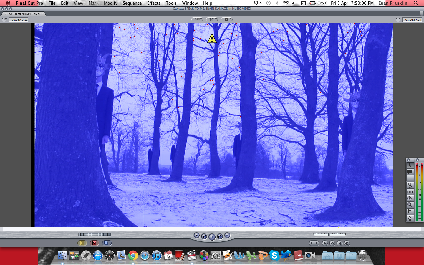
I used this shot for my album cover, creating it originally from Final Cut Pro. To achieve the Split-Screen effect, which I have wanted to do from the beginning, I had to get THE LAUGHING MAN to stand behind every tree using the same shot. In FCP, I had to join all of the shots together and then crop them so it appears to be one video:


I tinted the the video blue to create the cold and depressing atmosphere. It also fits with the colour-scheme of the overall video (using green, yellow and red). I had the Lunatic holding a guitar but not playing it. I thought I had to have the inclusion of an instrument of some sort because the band emphasises their instruments. Since the Lunatic is also based on Syd Barrett, who was famous for his innovative guitar-playing skills. One of the strings has been removed to imply that the Lunatic is being robbed of his gift, which is close to what happened to Barrett. 

Later on in the evening, we shot the KITCHEN SEQUENCE - involving a confrontation between the Lunatic and the Laughing Man. 


Here, I've added an effect of a Bad TV. I have increased the waviness and static of the image. This is to increase the sense of conflict within the scene. It represents the Lunatic's distorted mindset. 


I wanted to have the effect of a digital image, so I faded the colour in many parts. This is to contrast from earlier, when the landing sequence is edited to look like it was shot on black-and-white celluloid film. Because I want this band to be heavily associated with film, I thought I could attempt to present this transition from celluloid film into digital technology. 

This conflict with The Laughing Man is significant because I want the audience to question whether it really is the Laughing Man, or somebody else. Since the name of this sequence is called 'BREAKDOWN', I wanted the Lunatic to experience the worst kind. I will eventually get a voice-over done of a woman saying things but we can see it is the Laughing Man saying it. This suggests that the Lunatic sees the Laughing Man everywhere, even on real people. I also need to quicken the editing on this scene to make it seem more dramatic. 

Moving right along...


Tuesday, April 2, 2013

Digipak progress - front and back covers

Hello all.

I have been working more on my digipak. I have recently decided that it should be more modern, so I have taken inspiration from the albums by MUSE, who are part of the new-prog culture. I looked at album covers first and this one in particular caught my eye:


This is the cover for their album 'Black Holes and Revelations'. I love the vibrancy of colour, the science-fiction setting (appropriate for the album's name) and its surrealist approach. The four people on the cover represent the four horseman of the Apocalypse, as mentioned in the Book of Revelations. The images of the band members are not featured on the front cover, which is a similar approach to Pink Floyd - it is the music that matters, not the members themselves.

In order to achieve this kind of style, I attempted a first draft of my own:

 The interesting thing about Muse's album covers is that they use a logo for their name. This was part of the reason why I used the Mac software 'Logoist' to create this album cover as a whole. The 'GOOD vs EVIL' text is in a medieval font to indicate its old usage as a theme in art. Good and evil can be traced back to some of art's earliest years. 'METAPHYSICAL MAYHEM' is styled in an Ancient Greece-like font because of the early philosophy surrounding the notion of 'metaphysics'. This would appeal to the more intellectual - as well as mature and experienced - audience. These age-old themes are supported further by the black, wickedness of the trees which have a witch-like look to them. Forests also connoted places of darkness and mystery in fairy tales such as 'Little Red Riding Hood'. This dark, fantastical element to the cover also fits into the Gothic category, which appeals to the 'Goth' or 'Emo' youth sub-culture. This is a key demographic for the band.

I have made the back cover like this:


As you can see, it bares many similarities to the front cover. The only discernable difference is that THE LAUGHING MAN's replicas have been removed completely from the image. This is to achieve a kind of 'now you see him, now you don't' effect to highlight the album's theme of schizophrenia. The back cover is used to show the reality of the situation, shown from the Lunatic's point of view.
I have placed the Track List on the closest black tree and used a clear, white colour - as well as uppercase lettering - to make it noticeable. I did not want to centre the Track List because I feel it would divert away from the overall image, its meaning and how it relates to the front cover.
I have made my own label for the Music Institution so as to avoid any Copyright violations and created a logo for it - also using Logoist:


With Logoist, I have been able to achieve many things with my digipak so far. It has allowed me to placed text on a given image: move it, colour it, make it bold; and alter the colour of an image, as well as its shading, border and filling. It gives me the necessary tools in order to create a great digipak, without costing very much at all (£13, roughly £40 cheaper than Adobe Photoshop).


Tuesday, March 12, 2013

Filming and Editing Day 3 - DONE!

Hello, peoples!

I have finished filming editing day three, which involved the Bedroom, Landing and Stairway scenes. I started with filming the Bedroom scene first and go on chronologically from there, so the actors knew where the finished film was going.

I paid massive attention to the mise-en-scene of the Bedroom scene because I thought it was a key insight into the Lunatic's character. I wanted the environment to be rather bear on the walls, with only a few posters up - relevant to his character.


As we can see, the most obvious features on the wall are the photos of women, revolving around a fast-food hamburger. This is to represent his pleasures, which are rather animalistic. They are used to show how secluded he is from the rest of the world as well as the Lunatic's teenage instincts. This would make it instantly appealing to teenage boys. The wall is mainly white, with blue/grey stripes going down. I thought this looked very much like a prison, which the Lunatic seems to be encapsulated in.
A poster from the famously controversial 1971 film 'A Clockwork Orange' is also on the wall. The target audience would recognise this intertextual reference because of the psychological and ethical elements within it. I framed the Lunatic's head like this in the image to show that he is not paying attention to what is on his wall. He is looking straight ahead of him, where the Laughing Man looms above.


I decided to film this from a rather low-angle in order to make The Laughing Man seem more intimidating. He is the domineering presence of the Lunatic's mind, and there is a constant battle between them. Like I have said in previous blog posts, I had him in a suit to add to his 'desire-for-domination personality'. He looks straight into the camera, as if he were looking at us - even though he's really looking at the Lunatic. This allows us to get into the Lunatic's mindset, achieved through these subjective camera angles. The lighting used was also rather appropriate because of the shadow which reflects behind him. This allows the audience to see that he is indeed a dark presence within the film.

To make the film even more surreal, I took further inspiration from '2001: A Space Odyssey'. I was inspired by the last fifteen minutes of the film where the title character, Dave, keeps witnessing an older form of himself. I have attempted to do the same, where the Lunatic witnesses different forms of himself - though this would represent different psychological forms.


The framing of these shots were directly inspired by the extract from 2001:


Since this is also a rather famous scene, it could fit as another intertextual reference (which many film-fans would enjoy because Stanley Kubrick, the director of 2001, also made A Clockwork Orange). This continues with the Lunatic discovering different rooms, representing his fall into madness as he delves deeper and deeper. He tries to find out what the dark presence is in his mind and attempts to stop it. 
Throughout the Bedroom sequence, in the edit I noticed that it was too dark to actually see anything. So, I decided to increase the brightness of the video. This not only enables us to see what the characters are doing but also gives a surreal juxtaposition. The whiteness makes the bedroom seem more heavenly, but the Laughing Man's presence contradicts that - thus confusing the audience's expectation. 
The Bedroom sequence marked the beginning of the cinematic element to the film. Like in music videos by 30 Seconds To Mars, I decided to make mine like a short film. This contains gaps when the original music is not playing. It was difficult finding a piece of music to cover the ending Bedroom sequence and Landing sequence. It had to be surreal and it couldn't have singing involved. So, I decided to use 'Shine On You Crazy Diamond Parts 1-5' as the background score in the cinematic sequences. Fans of Pink Floyd would recognise that this song also relates to Syd Barrett and his schizophrenia. 


In the Landing sequence, I wanted a first confrontational scene between the Lunatic and the Laughing Man. In this scene, we see the Lunatic approaching carefully as the Laughing Man simply stands there. This is to show the Lunatic's fear. To display this further, I filmed a shot involving the Lunatic's feet, which is a great way to show fear and wariness. I had myself on the floor and I followed the actor's feet by slowly panning hand-held.


I centralised focus on the feet, as if nothing else were important. The following shot is of the Laughing Man:


I made it a dutch-tilt to suit the surreal, uneasy feel of the film. It also provides perfect observation to when the Laughing Man walks down the stairs. The Laughing Man's costume stands out from the rest of the mise-en-scene because it is darker than anything else. So, all attention is drawn to him.

When the Laughing Man goes down the stairs, I needed the Lunatic to follow - but hesitantly. So, I decided to have the camera follow him as he walks toward the stairs - demonstrating his fear and anxiety.


I used cameras from only two different angles - front and rear. I thought the audience has to be on this journey with him in order to understand his psychology. It has to be from a subjective point of view. I think it also builds up the suspense - the audience is wandering what will happen and when it will happen (typical in films by Alfred Hitchcock). 


 This shot is significant because it adds to the idea that the Lunatic is delving deeper into his dark side. The downstairs goes into his darker frame of mind, as it were, and this is where the Laughing Man lingers.

 When the Lunatic goes down the stairs, I wanted to indicate the passing of time without spending too much of it in discourse. So, I decided to use a 'Dissolve' transition twice to indicate this passing of time. This angle is perfect because his body blocks the light above, which makes the front of his body appear darker and spectral. This shows that as he goes further into his dark side, he himself changes as well.


Sunday, February 24, 2013

Filming (and Editing) Day 2 - DONE!

Hello everybody!

Sorry I haven't blogged in a while. I've recently finished filming some of the scenes in the music video.

Here are some storyboards I had prepared for the shoot:

THERAPY SEQUENCE(s)


BEDROOM SEQUENCE:
LANDING SEQUENCE (1):


LANDING SEQUENCE (2):

HALLWAY SEQUENCE:                              
 KITCHEN SEQUENCE:


HALLWAY SEQUENCE(s) (2):


I've lost the storyboard for the GARDEN SEQUENCE, so I cannot show you the storyboard of it. However, I had it on the day and it seemed to work very well. This sequence was set in my back garden to follow the opening lyrics of 'Brain Damage': "The lunatic is on the grass...". I wanted to do a dolly shot moving toward the Lunatic as he simply sits still on the grass. I had to hold the camera whilst being pushed on a wheelchair by - in professional terms - the Grip person. Unfortunately, the camera was rather shaky and moved about quite a lot. So, to resolve it, I used the 'SmoothCam' tool in Final Cut Pro.


This made the camera seem much smoother in its movement. However, the display itself in the video is shaky but the camera appears smooth. I believe I can use this to demonstrate the fragility and disturbance in the Lunatic's mind.


To delve into the Lunatic's mind even further, I decided to modify the colours of the video. I had a specific colour scheme for each of the scenes. This is to show the different scenes which the Lunatic appears to see. I plan on filming an ECU on the Lunatic's eye and every time it blinks, a different colour filter is presented. This is a technique used in Stanley Kubrick's 2001: A Space Odyssey:


With the garden sequence, I had filtered it with green to go with the overall green environment. It also provides an ill or sick effect, which the Lunatic experiences. Following on from that idea, I used a yellow colour filter for the street scene:


I'm debating whether or not to use this filter because I think the blackness really adds to the darkness of this particular scene. I also used this method in the beginning scene in the SPEAK TO ME section. When night fell after filming the garden sequence, I was able to film the Lunatic sitting on the sofa and speaking to his therapist:


Here, I've made the filter more red - which goes well with the furniture and surrounding objects. I think red presents the suggestion of intensity and anger, which I thought appropriate in the therapy scene.
To make it seem like the character is undergoing the symptoms of schizophrenia, I have edited the footage together to give the illusion that he has Multiple-Personality Disorder. In the first part of the dialogue sequence, the shot above is given - angry and trying to prove a point. In the second part, I wanted the Lunatic to be more scared and open to his therapist - so I had him lying down on the sofa:


The Lunatic does not notice this change in personality, which makes it more realistic - in spite of the surreal style.

I wanted to make sure that I had the Laughing Man with the Lunatic in most scenes. So, I included them in both the garden and therapy sequences:


Here, I wanted a good shot from the Lunatic's perspective. So, I decided to compose a Over-The-Shoulder shot to achieve this. It worked well because of the simplicity in the Laughing Man's presence, which is rather terrifying.

In the therapy sequence, I made the Laughing Man be the Therapist. This was to mean that the Lunatic could find no escape and have no trust for anyone in his state:


In this part of the song, there is a cash register sound going on in the background. I have edited two shots together so they become in-sync with this sound:


I thought this editing could symbolise the Lunatic's feeling that the Therapist is only after his money. So, the edit with the sound of the cash register suits this perfectly.

With the ending sequence I had initially intended to replicate the Lunatic three times on the sofa. This would give the illusion that three Lunatics are sitting on this sofa. However, it proved impossible to line up the three images together. So, I decided to just have lines going down the middle - showing that they are on the sofa, yet different from one another:


I will try to improve it but this is the basic image. I want to give off the impression that although they are the same person, they are completely different from one another - without even realising it. The lines down the middle separate them and also give a sense of confinement and claustrophobia. 

Tuesday, February 5, 2013

Brand Identity

As a homework, our teacher told us to try and figure out the identity of our band. I started by doing a few brainstorms:


Here I was covering what was going to be involved in my music video, who it will appeal to, and what genre it is in.


Here I was trying to establish what the Digipack was going to be like. I had to relate this to the band's intended identity. It was at this point that I decided to call the band "GOOD VERSUS EVIL" to give it a more intellectual, philosophical edge - like many songs and albums by the Prog-Rock band MUSE ('Supermassive Black Hole', 'Thoughts of a Dying Atheist', 'Black Holes and Revelations', 'Origin of Symmetry' etc). Likewise, for the Digipack, I want to create a similar kind of name for it. I thought of three names: 'Metaphysical Mayhem', because of the difficulty in differentiating between reality and imagination; 'The Crazy Complex', because of the protagonist's difficulty in coping with his schizophrenia; or 'Schizophrenic Serenity', because of the antagonist's joy in torturing the protagonist.

I think I may go for 'Schizophrenic Serenity' because my music video ends with THE LUNATIC, the protagonist, accepting the 'reality' of the LAUGHING MAN, the antagonist. Whether this is a good thing or not is uncertain. But THE LUNATIC seems calmed and relaxed in his own imagination.


With the poster, I plan to compromise between a scene in my music video and a 30 Seconds To Mars poster:


The crimson colour scheme is exactly what I am trying to achieve. In the music video scene, the LUNATIC is in therapy - the therapist being THE LAUGHING MAN. I would like to have both THE LUNATIC and THE LAUGHING MAN on a red sofa, in front of a red curtain. I'm wondering whether I should put the "GOOD VERSUS EVIL" logo on the red curtain, which will be above the two characters, or not. 30 Seconds To Mars appear not to have done that, which adds to their dark mystery. It is also noticeable that members' dark appearances contrast heavily to the crimson backdrop - making us notice them a great deal more. I may use this method with my own poster.


I also did a word document presenting many of the ideas I've written about already:


GOOD VERSUS EVIL
Brand Identity

PROGRESSIVE ROCK

Since my chosen song is a part of the Progressive Rock genre, I thought I would take inspiration from other prog-rock bands. However, I still want to appeal to a modern audience – so I decided to take elements from modern progressive rock (new-prog). This features bands such as 30 Seconds To Mars, Muse, and Radiohead. One common feature of all their music videos is dark and surreal imagery, often with a conceptual or dreamscape environment. I think this appeals to many youth groups of today, who are more attracted to the darker side.

I want to use the same style of music videos as 30 Seconds To Mars. Their videos are made like short films – with either a narrative- or concept-based framework. “HURRICANE” is a good example of this. They also include many intertextual references of well-known movies within their work. I also want to use a similar mise-en-scene to them.


MISE-EN-SCENE

The make-up will consist of black eye-shadow and black nail varnish. This is what 30 Seconds To Mars does to appeal to an audience more attracted to the dark. It also has a rebellious side to it, since it is not common for men to wear eye shadow or nail varnish. This carries on the spirit of rock n roll.

However, to make it more appropriate to the band name “GOOD VERSUS EVIL”, I felt that there has to be a conflict between the light and the dark. This will be shown through the costume. The protagonist wears a white shirt, which is an indication of the goodness within him. It is at odds, however, with the black trousers and shoes. This clearly shows that conflict between good and evil in him. This will be mostly during the house and forest scenes. In the street scene of the music video, I had a dark jacket covering his white shirt – indicative of his falling into darkness.
The antagonist, known as the LAUGHING MAN, is far more surreal and abstract. I have him wearing a Venetian mask and a black suit. This is to add to the dreamscape scenario occuring in the LUNATIC’s head. This costume for THE LAUGHING MAN brings out his evil qualities, particularly since no emotion can be seen behind the mask. The suit provides a desire for dominance, which the LUNATIC must attempt to fight off.  


TARGET AUDIENCE

All of the features I have described previously are to appeal to a particular audience. I think this most appeals mainly to youth groups who are more attracted to the darker side. The use of dark colours, costumes and make-up would mainly appeal to the Emo youth sub-culture, who dress very similarly to 30 Seconds To Mars. I also think my protagonist’s hairstyle - which is fairly longer than most - would appeal to that group too.

I think this video would probably attract older audiences as well because of the age of the song. “BRAIN DAMAGE” - by Progressive Rock band Pink Floyd - is from 1973 and the album “THE DARK SIDE OF THE MOON” was fairly popular. So, fans of that song would be attracted to the video.

In terms of gender, I believe a male audience would be drawn to the band than a female audience. The singers are all male and the darker imagery would probably appeal more to men. However, since the Emo sub-culture is not limited only to men, it is highly possible that women will be attracted to the video as well as men.