Saturday, April 27, 2013

Digipak Advert Poster - first draft

Hello all!

I have finished doing the first draft of my Digipak album poster. I created it using Logoist:


Starting off with the image, I was inspired by the painting 'madness' by Alfred Kubin:


I thought this could be easily relatable to the nature of the band. This painting clearly focuses on madness and the problem of good and evil, which are major elements in the band's identity. The evil is hammering away at the good, making him become mad. In my image, I set the location by a piano - alluding to the band's music - inside a house with the evil side (THE LAUGHING MAN) attempting to hammer the good side's (the Lunatic's) head. Unlike Kubin's painting, the Lunatic is darkened beyond recognition. This is to provide an enigma for the audience to solve but it also represents the Lunatic's falling into darkness. The band identity is associated with characters and role-play, so I thought this particular representation was appropriate.

Like the album cover, I used an archaic font for 'GOOD vs EVIL' to serve as a logo for the band. It is the largest piece of text on the poster, so that it is the first thing people see when they look at it.  For 'METAPHYSICAL MAYHEM', I retained the same Ancient Greece-like font but I changed the colour to red. I thought this was a striking colour to use and it really shouts at the reader. I also used it for the 'OUT NOW' text for the same effect.

For the text 'INCLUDES THE NEW SINGLE BRAIN DAMAGE', I wanted a font that looked like an old-fashioned horror film. This can be associated with the trailer for George A. Romero's 1968 zombie film 'Night of the Living Dead' and certain posters from the 1960s:
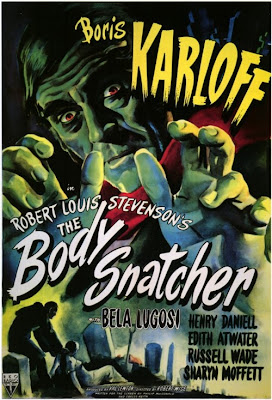
This is for keeping to the band's identity, which is heavily associated with film and cinema history - particularly that of horror. 

The text for 'OUT NOW' is coloured in red, like "METAPHYSICAL MAYHEM"'s font. This colour is used for the consumer to recognise the importance of these two texts. They must now the name of the album in order to buy it and they must know it is OUT NOW. It is made larger than the text on the lower third to draw further attention to it, as well as strongly encouraging the consumer to buy it (preferably NOW). 

To further market the product as well as the band, I have included links to websites on the poster. Blue is another attractive colour, which suits the differing colour scheme. It also reflects the usual colour of hyperlinks to websites on the internet in general. I used the social networks Facebook and Twitter because they are the most popular. I also retracted the 'http://www.' before each website title to make it look cleaner and appeal more to the younger generation, who are more experienced in technology. 

Thursday, April 11, 2013

Digipak - pretty much done!


ALBUM COVER (AND BOOKLET COVER):


To improve the front cover, I decided to place the text in the corner of the image. This is what Muse does on the cover for 'Black Holes and Revelations'. I thought it would direct more attention to the image whilst also standing-out. I have improved the text for the "GOOD vs EVIL" text to have it glow more, making it stand out. The old colour seemed too grey and was difficult to see. Presenting it in this colour also gives it an almost religious element, alluding to the battle between Heaven and Hell.


BACK COVER:


As I have said before, this is cover is to mark a difference from the front cover. It produces a "now you see him, now you don't" effect - fitting with the theme of schizophrenia for the character.


DISC:


With the disc, I joined two images together of the Lunatic and the Laughing Man. Combining them both represents the split reality that the Lunatic is experiencing. This is a key element of GOOD vs EVIL's band identity. They want their audience to experience something different, something psychological, something spiritual. The surrealism of the image appeals to the dreamscape I tried to attempt. The two band members are characters in their own right and the tracks on the album are all about their conflict with one another. Conflict is a key dramatic effect which audiences enjoy in other media texts like film and television. GOOD vs EVIL try to mimic that in their performances.

I have made the track list in block capitals so they really stand out. I have made their colour white to suit the black-and-white scheme on the entire digipak. This is to represent the 'Ying and Yang' approach to Good and Evil, which many people would be familiar with.

BOOKLET - FIRST DOUBLE-PAGE


There is a great sense of death in this first double-page, which represents perfectly what the band represents. Since GOOD vs EVIL appeals mainly to the emo youth sub-culture, death is an appropriate topic to cover. The ticking, Dali-esque clock shrouded in darkness represents the limited duration of existence. Because this is also a complicated topic, it would also appeal to the middle-aged generation - who are more likely to be educated in existentialism. 

I've included a track list in the booklet as well. I have spaced the tracks at a considerable distance from on another to show that each song has its own individual merit. I didn't use a large font size because I wanted to feel that the darkness is overtaking the light. The whole album is shrouded in darkness with limited light, showing the identity the band is more attracted to. I also provided information about the band members and what they contributed to the album. This font is not in uppercase because this information is less important. GOOD vs EVIL care more about the music being played instead of recognition for who created it. 

BOOKLET - LYRIC PAGES (part 1)


With these pages of lyrics, I have kept to the 'Ying and Yang' style to represent the message of Good and Evil. The use of contrasting colours appeals to the reader's psychology. It provides a sense of difference. 

The font used is fairly similar to that used by Pink Floyd in their album 'The Wall'. They had an image of a clean white wall with graffiti-like writing over the top for the lyrics. These lyrics look like they have been written down and a fair amount of precision has contributed to it. This is to show the Lunatic's state of mind. The presentation of the lyrics in this way allows us to experience what is happening inside his head. This appeals to the target audience because of its intended minimalism, fearful intent and surreal presentation. 

BOOKLET PICTURE:


This image is taken to show the Lunatic's struggle against the Laughing Man. It also marks a transition between the two sets of songs, which have different styles from one another. I positioned the Lunatic right forward in the frame because this is who we empathise with the most. He has fallen and we wish for him to be able to stand up. The Laughing Man looms in the background, almost like a spectral floating head haunting the Lunatic. His falling over indicates that he has almost given up and submitted to the Laughing Man.

LYRIC PAGES (part 2):


In this lyric double-page, I've included a picture of the Lunatic lying on the bed with a light shining from the right. I thought that this was rather appropriate for the song. It also looks quite metaphysical because of the soul-like features in the image. This carries on the heavenly idea implied in the logo of GOOD vs EVIL on the album cover. There is a juxtaposition also between what is surrounding the Lunatic and what he really feels. White light is surrounding him from all sides and yet his expressions do not connote a sense of happiness or joy. I wanted it to look as if the Lunatic does not want to be in this environment, or he is questioning it. Since his face is far darker than the rest of the image, it could be suggested that he is wanting to move further into the dark side. 

The Lunatic's apathetic attitude would appeal to: teenagers because of their stereotypically lazy personality, which they can relate to; religionists because of this heavenly idea of a soul; and atheists (and, perhaps, satanists) because of this denial of Heaven or God being an omni-benevolent presence. Nevertheless, it is an appeal to the darker side of human nature. This would mostly appeal to the emo or goth youth sub-culture. 

I used a light behind the Lunatic's head in order to make his face look darker, whilst at the same time giving the illusion that the light wants to pass through. 


BOOKLET PICTURE:

This image presents the idea that the Lunatic is descending further and further into darkness until he becomes a silhouette of his 'good' self. As we can see, he is climbing down from the upstairs - which is brightly lit and white - to the downstairs, which is dark and unpredictable. The four lights on the ceiling above the actor were very useful in providing this image. The high-key lighting hit the actor's figure and immediately created this silhouette. This creates a spectral, unknowable character. 

LYRIC PAGES (part 3):


LAST PAGE:


BOOKLET: Back Cover


Sunday, April 7, 2013

Filming and Editing DAY 4 - Done (pretty much)

I've finished compiling the footage shot on the fourth day and edited it together.

First I shot out in Knole Park for the FOREST SEQUENCE. It was quite an appropriate setting because it had been snowing a fair deal, so this captures the desolation and solitude that the Lunatic is experiencing - whilst still being outside.

There may have been some health-and-safety concerns because of the conditions in which we were shooting. It was rather cold with a very bitter wind. I took some safety precautions: bringing a flask of tea, bringing extra layers and blankets etc. I'm not sure what else I could have done but it was difficult to film. We had to shoot everything quickly and succinctly, which made me concerned as to how it would look. Luckily, the footage looked fine and I edited it without much difficulty.


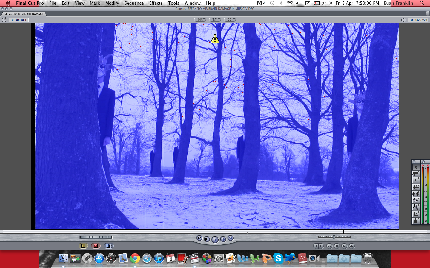
I used this shot for my album cover, creating it originally from Final Cut Pro. To achieve the Split-Screen effect, which I have wanted to do from the beginning, I had to get THE LAUGHING MAN to stand behind every tree using the same shot. In FCP, I had to join all of the shots together and then crop them so it appears to be one video:


I tinted the the video blue to create the cold and depressing atmosphere. It also fits with the colour-scheme of the overall video (using green, yellow and red). I had the Lunatic holding a guitar but not playing it. I thought I had to have the inclusion of an instrument of some sort because the band emphasises their instruments. Since the Lunatic is also based on Syd Barrett, who was famous for his innovative guitar-playing skills. One of the strings has been removed to imply that the Lunatic is being robbed of his gift, which is close to what happened to Barrett. 

Later on in the evening, we shot the KITCHEN SEQUENCE - involving a confrontation between the Lunatic and the Laughing Man. 


Here, I've added an effect of a Bad TV. I have increased the waviness and static of the image. This is to increase the sense of conflict within the scene. It represents the Lunatic's distorted mindset. 


I wanted to have the effect of a digital image, so I faded the colour in many parts. This is to contrast from earlier, when the landing sequence is edited to look like it was shot on black-and-white celluloid film. Because I want this band to be heavily associated with film, I thought I could attempt to present this transition from celluloid film into digital technology. 

This conflict with The Laughing Man is significant because I want the audience to question whether it really is the Laughing Man, or somebody else. Since the name of this sequence is called 'BREAKDOWN', I wanted the Lunatic to experience the worst kind. I will eventually get a voice-over done of a woman saying things but we can see it is the Laughing Man saying it. This suggests that the Lunatic sees the Laughing Man everywhere, even on real people. I also need to quicken the editing on this scene to make it seem more dramatic. 

Moving right along...


Tuesday, April 2, 2013

Digipak progress - front and back covers

Hello all.

I have been working more on my digipak. I have recently decided that it should be more modern, so I have taken inspiration from the albums by MUSE, who are part of the new-prog culture. I looked at album covers first and this one in particular caught my eye:


This is the cover for their album 'Black Holes and Revelations'. I love the vibrancy of colour, the science-fiction setting (appropriate for the album's name) and its surrealist approach. The four people on the cover represent the four horseman of the Apocalypse, as mentioned in the Book of Revelations. The images of the band members are not featured on the front cover, which is a similar approach to Pink Floyd - it is the music that matters, not the members themselves.

In order to achieve this kind of style, I attempted a first draft of my own:

 The interesting thing about Muse's album covers is that they use a logo for their name. This was part of the reason why I used the Mac software 'Logoist' to create this album cover as a whole. The 'GOOD vs EVIL' text is in a medieval font to indicate its old usage as a theme in art. Good and evil can be traced back to some of art's earliest years. 'METAPHYSICAL MAYHEM' is styled in an Ancient Greece-like font because of the early philosophy surrounding the notion of 'metaphysics'. This would appeal to the more intellectual - as well as mature and experienced - audience. These age-old themes are supported further by the black, wickedness of the trees which have a witch-like look to them. Forests also connoted places of darkness and mystery in fairy tales such as 'Little Red Riding Hood'. This dark, fantastical element to the cover also fits into the Gothic category, which appeals to the 'Goth' or 'Emo' youth sub-culture. This is a key demographic for the band.

I have made the back cover like this:


As you can see, it bares many similarities to the front cover. The only discernable difference is that THE LAUGHING MAN's replicas have been removed completely from the image. This is to achieve a kind of 'now you see him, now you don't' effect to highlight the album's theme of schizophrenia. The back cover is used to show the reality of the situation, shown from the Lunatic's point of view.
I have placed the Track List on the closest black tree and used a clear, white colour - as well as uppercase lettering - to make it noticeable. I did not want to centre the Track List because I feel it would divert away from the overall image, its meaning and how it relates to the front cover.
I have made my own label for the Music Institution so as to avoid any Copyright violations and created a logo for it - also using Logoist:


With Logoist, I have been able to achieve many things with my digipak so far. It has allowed me to placed text on a given image: move it, colour it, make it bold; and alter the colour of an image, as well as its shading, border and filling. It gives me the necessary tools in order to create a great digipak, without costing very much at all (£13, roughly £40 cheaper than Adobe Photoshop).