Hello all!
I have finished doing the first draft of my Digipak album poster. I created it using Logoist:
Starting off with the image, I was inspired by the painting 'madness' by Alfred Kubin:
I thought this could be easily relatable to the nature of the band. This painting clearly focuses on madness and the problem of good and evil, which are major elements in the band's identity. The evil is hammering away at the good, making him become mad. In my image, I set the location by a piano - alluding to the band's music - inside a house with the evil side (THE LAUGHING MAN) attempting to hammer the good side's (the Lunatic's) head. Unlike Kubin's painting, the Lunatic is darkened beyond recognition. This is to provide an enigma for the audience to solve but it also represents the Lunatic's falling into darkness. The band identity is associated with characters and role-play, so I thought this particular representation was appropriate.
Like the album cover, I used an archaic font for 'GOOD vs EVIL' to serve as a logo for the band. It is the largest piece of text on the poster, so that it is the first thing people see when they look at it. For 'METAPHYSICAL MAYHEM', I retained the same Ancient Greece-like font but I changed the colour to red. I thought this was a striking colour to use and it really shouts at the reader. I also used it for the 'OUT NOW' text for the same effect.
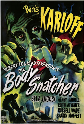
For the text 'INCLUDES THE NEW SINGLE BRAIN DAMAGE', I wanted a font that looked like an old-fashioned horror film. This can be associated with the trailer for George A. Romero's 1968 zombie film 'Night of the Living Dead' and certain posters from the 1960s:
This is for keeping to the band's identity, which is heavily associated with film and cinema history - particularly that of horror.
The text for 'OUT NOW' is coloured in red, like "METAPHYSICAL MAYHEM"'s font. This colour is used for the consumer to recognise the importance of these two texts. They must now the name of the album in order to buy it and they must know it is OUT NOW. It is made larger than the text on the lower third to draw further attention to it, as well as strongly encouraging the consumer to buy it (preferably NOW).
To further market the product as well as the band, I have included links to websites on the poster. Blue is another attractive colour, which suits the differing colour scheme. It also reflects the usual colour of hyperlinks to websites on the internet in general. I used the social networks Facebook and Twitter because they are the most popular. I also retracted the 'http://www.' before each website title to make it look cleaner and appeal more to the younger generation, who are more experienced in technology.


No comments:
Post a Comment