QUESTION 1
In what ways does your media product use, develop or challenge forms and conventions of real media products?
MUSIC VIDEO
To gain an understanding of the basic conventions used in music videos, I researched Andrew Goodwin’s Music Video Theory. A prominent feature is the notion of looking or watching something. In my music video, I have utilized this convention in two ways. The one used commonly in music videos is toward the camera.
This adds a direct involvement from the character to the
band’s audience. They are actively involved.
The other method - more specific to my video - involves both the protagonist and antagonist gazing at each other.
This creates a conflict in the narrative I have presented in the music video, which is another common convention of music videos in general. Both of these methods tend to follow Goodwin’s idea of close-ups within music videos to better advertise the band. I attempted to do this whilst retaining the style of the video. Since the music video is taken from a subjective point of view, it made sense to have plenty of close-ups on the protagonist.
I wanted there to be a relationship between the lyrics and the visuals in the video. However, I did not want to be limited in making creative decisions for a video illustrating the lyrics; neither did I want to contradict them either. It is common for music videos, particularly those of the Prog-Rock genre, to amplify the lyrics. This is what I have tried to do. I researched the sub-text of the song, which is about a former band member experiencing schizophrenia. So, I decided to make my video based on that knowledge. The lyrics themselves also dictate quite explicit images: ‘The Lunatic is on the grass’,
‘The Lunatic is in the hall’,
and ‘You lock the door and throw away the key’.
One common convention I have challenged in my own music video is the objectification of women. I only have brief shots of a young woman, who tears apart the protagonist’s mindset. However, there is some complicated stereotyping involved. Once the Lunatic enters the Kitchen, he sees his enemy – The Laughing Man – washing up the dishes.
Through voice-over, however, we know that it is really the Lunatic’s girlfriend – who he is delusional enough to think she is the Laughing Man. So, in terms of the narrative, it could be said that I have stereotyped women to give the audience quicker and easier understanding as to what is happening. Since women are commonly associated with washing up, I thought I would utilize this device. I also made her have a stupid American accent to display a lack of intelligence. This is to further display her innocence in the situation, which - in a peculiar way - fits with Laura Mulvey's theory of virgin/whore dichotomy.
The only objectification within the music
video, if any, would be of the man. He walks around in the main narrative
scenes topless – showing his muscular physique. This would appeal more to the
heterosexual female audience. This is going against Laura Mulvey’s Male Gaze
theory that media texts are created from the heterosexual man’s point of view. It can even be considered as a 'Female Gaze'. Mulvey's theory is often proven correct in many music videos but I wanted to divert from
this convention to separate from the pack.
To make my music video, I had to have
knowledge of the conventions used in other videos of the same genre. I had
chosen the song ‘Brain Damage’ by Pink Floyd, who are a part of Progressive
Rock. Since Pink Floyd formed in the late 1960s, no professional music videos
of their songs were made. So, I had to look at modern equivalent – often
referred to as New-Prog, which includes bands like: 30 Seconds To Mars, Muse
and Radiohead. All of them contained
dark and surreal styles, which suits the style of the song. The videos often
washed the low-key lighting with colours, which are quite vibrant.
Since
Prog-Rock is a movement pursuing more artistic methods, these techniques are
most appropriate.
One unconventional method I used was making
the music video as a short film. This is what 30 Seconds To Mars does with most of their videos because of the
band leader’s, Jared Leto’s, popularity as a film actor. In their music video Hurricane, the video is split into
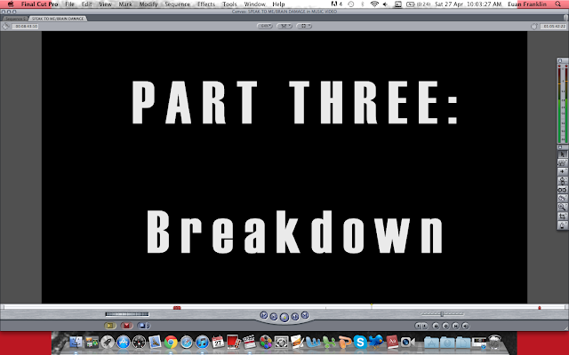
narrative stages (Part One, Part Two etc) and contains short
extracts from their other songs. The latter is used for when the main song is
not playing, and a scene from the short film is playing.
This is what I tried to do with my music video. I split my video into three parts, excluding the prologue, to make it seem more like a story than a advertisement for the song/album.

This is what I tried to do with my music video. I split my video into three parts, excluding the prologue, to make it seem more like a story than a advertisement for the song/album.

I also used a widescreen format – 2.35:1, used quite effectively in the Coppola’s 1979 film Apocalypse Now. Music videos do not often use an aspect ratio this wide, which makes mine more memorable.
On three of the shots used in "BRAIN DAAMGE", I did not apply this widescreen format. These shots appear consecutively and all contain the Lunatic screaming. This is almost a glimpse into his real self or selves before he enters a psychological - almost hallucinogenic - journey. This is not conventional at all in music videos, nor in many movies. Though it is used in Christopher Nolan's 'The Dark Knight' for majestic establishing shots.
DIGIPAK
I had researched tangible albums and their
contents as well as digital editions on iTunes (LP) to formulate ideas for my
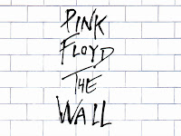
Digipak. I mainly focused on albums by Pink Floyd, particularly The Wall and The Dark Side of the Moon.

A common addition to these albums or digipaks is a booklet. This contains information about the band members’ contributions, lyric pages, abstract images and pictures of the band. I have included all of these conventional features but I did not want to do it in exactly the same way. Pink Floyd placed pictures of the band during live shows but I do not think this suits the band’s identity. I wanted them to completely immersed in the narrative of their music.
I was initially excited by the idea of not having any text on the front cover, like the cover for Dark Side of the Moon. However, this can be proved challenging because of the difficulty in marketing that product. It also does not fit in with the New-Prog style of album design, which always has text and logos present. I looked in particular at album designs by Muse:
To fit in with this convention, I too placed all the text in the top right-hand corner. The band name will be enlarged and treated more as a logo, and the album name will be positioned below it.
POSTER
With the Digipak poster, I took inspiration mainly from the advert for 30 Seconds To Mars's upcoming album, Love Lust Faith + Dreams:
In this poster, it seems that the image takes precedence. We can recognise the band just from their picture. I attempted to do this with my own poster:
Even though my image is more centred than the 30 Seconds To Mars one, it still dominates the poster. It is the first object the consumer sees. However, I have made darkened and almost impossible to see. This is why I thought that the band name required great visibility, unlike the poster for Love Lust Faith + Dreams. "GOOD VS EVIL" is easily the brightest text on the poster, which the consumer will see and understand. It is a convention to use the band name at the top of the poster, with uppercase lettering and large size, to increase visibility. I realised this from seeing other posters unrelated to this genre of music:
A noticeable difference between these somewhat conventional posters and my own is the differing fonts. Even the 30 Seconds TO Mars posters, despite varying between plain and bold, has essentially the same font. I wanted my poster to be multi-layered, as if each item of text has its own special significance. I have continued the same black-and-white colour scheme as in the Digipak. This is to preserve that idea of ying and yang. I had initially thought that the poster would look good with multiple colours but my teacher thought a varying colour scheme would be irrelevant. Like the Digipak's album cover, I have also stretched the image to preserve the band's surreal identity. I also made the release date larger and used numbers instead of letters. This links to their intellectual identity because of mathematical associations with philosophy.
I included the distributor's logo to advertise their company. This is done in the Kings of Leon poster above. I also placed links to both the company's and the band's websites. Previously, I had placed Facebook and Twitter links on the poster but this seemed to be taking up considerable space - so I removed them.


No comments:
Post a Comment